What Makes a Good Wireframe? (And What to Look For in These Examples)
Before diving into the examples, it's worth establishing what separates a good wireframe from a box-drawing exercise. In 15+ years of UX practice, three properties consistently distinguish wireframes that move projects forward from those that generate unproductive debate.
1. Clear Layout Hierarchy
A good wireframe answers the question: where does the user's eye go first, second, and third? Visual hierarchy in a wireframe is established through size, position, and spatial grouping — not color or typography. The most important element on a screen (usually a headline or primary CTA) should be visually distinct from supporting elements even in grayscale. Every wireframe in this library assigns a clear visual weight to its primary, secondary, and tertiary elements before any visual design decisions are made.
2. Explicit Functionality
Wireframes communicate what a user can do on a screen — not just what they can see. Interactive elements (buttons, dropdowns, tabs, toggles, form fields) must be visually distinguishable from static content, even at lo-fi. Labeling CTAs ("Add to Cart," "Sign In," "Continue to Payment") rather than using generic "Button" placeholders forces the team to think about the words before the visual design begins. You'll notice every example in this library labels its interactive elements explicitly — this is intentional and mirrors professional practice.
3. Deliberate Content Structure
Content structure means communicating types and proportions of content without committing to actual copy or imagery. Standard conventions: boxes with an X or image icon represent images; horizontal lines of varying width represent text; taller text blocks represent body copy. These conventions are universal and understood by developers, product managers, and stakeholders — making them the common language of early-stage design reviews.
What Good Wireframes Deliberately Omit
A wireframe deliberately withholds visual design decisions — final colors, brand typography, photography, icon styling, micro-animations. This omission is a feature, not a limitation. When stakeholders see color and imagery in a wireframe, they comment on the color and imagery. When they see only structure, they comment on structure. Matching the fidelity of your wireframe to the questions you're trying to answer is one of the most underrated skills in product design. Each example in this library is annotated with its fidelity level (Lo-Fi or Mid-Fi) to help you calibrate your own work.
How to Use This Wireframe Library
This library is organized by product type (website, mobile app, dashboard, ecommerce, login, social media) and annotated with the reasoning behind each design decision — not just the visual output. Here's how to get the most from it:
- Use the filter bar to narrow by category. If you're wireframing a checkout flow, filter to "Ecommerce" and study the checkout example annotations before opening Figma.
- Read the annotations on each card — they explain why the layout is structured that way, not just what it looks like. This is where the real learning happens.
- Note the fidelity badge (Lo-Fi / Mid-Fi) on each card. If you're in early discovery, study the Lo-Fi examples. If you're preparing for stakeholder review, study the Mid-Fi examples.
- Follow the "See Full Example" links to reach category-specific pages with deeper breakdowns, responsive variations, and additional examples in that category.
- Use the tool attribution on each card. If a pattern was created in Balsamiq, you can replicate it quickly even without premium tools.
The goal of this library is not to give you templates to copy — it's to help you internalize the reasoning behind common wireframe patterns so you can adapt them intelligently to your own projects.
Lo-Fi vs Mid-Fi vs Hi-Fi Wireframes: How to Choose
One of the most common wireframing mistakes is using the wrong fidelity for the question you're trying to answer. High-fidelity wireframes take 4–8× longer to produce than lo-fi ones. If you're still validating the concept, that time is wasted — and the polish can actually make stakeholders less willing to suggest structural changes because the design "looks finished."
| Fidelity | Time to Create | Best For | Best Tool |
|---|---|---|---|
| Lo-Fi | 5–30 min per screen | Concept validation, early ideation, rapid user testing | Paper, Balsamiq, Whimsical |
| Mid-Fi | 30 min–2 hrs per screen | Stakeholder review, dev handoff prep, usability testing | Figma, Axure RP, Sketch |
| Hi-Fi | 2–8+ hrs per screen | Visual design validation, final stakeholder sign-off | Figma, Adobe XD |
The Decision Framework
Ask yourself: what is the most important unresolved question about this design? Match your fidelity to that question:
- "Is this the right concept?" → Lo-fi. Sketch 5 alternatives in the time it would take to build one mid-fi wireframe.
- "Does this flow make sense to users?" → Lo-fi to mid-fi. Enough structure to test, not so polished that users hesitate to give honest feedback.
- "Is this the right visual direction?" → Mid-fi moving to hi-fi. Now you're ready to introduce visual design decisions.
- "Is this ready to build?" → Hi-fi or design spec. Every edge case documented, every component defined.
The wireframes in this library sit primarily at Lo-Fi and Mid-Fi — the stages where structural decisions are made and where referencing established patterns is most valuable. For hi-fi visual design, your brand guidelines and design system take over.
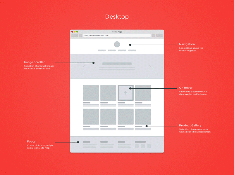
Website Wireframe Examples
Website wireframes are the most commonly needed wireframe type in product and marketing teams. The examples below cover the core page templates every web project requires: homepage/hero layouts, lead generation landing pages, and content/blog pages. Each follows the 1440px desktop-first convention with notes on mobile breakpoints.
The key structural decision in all website wireframes is above-the-fold priority: within the first viewport height (~900px), a user should understand what the site does, who it's for, and what they should do next. Every homepage wireframe in this library achieves this without scrolling.
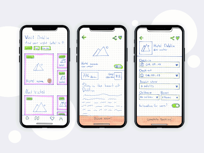
Mobile App Wireframe Examples
Mobile wireframes present unique structural challenges: limited screen real estate, thumb-zone constraints, and navigation patterns that differ fundamentally from desktop. The examples below cover onboarding flows, feed/home screens, and split-view patterns.
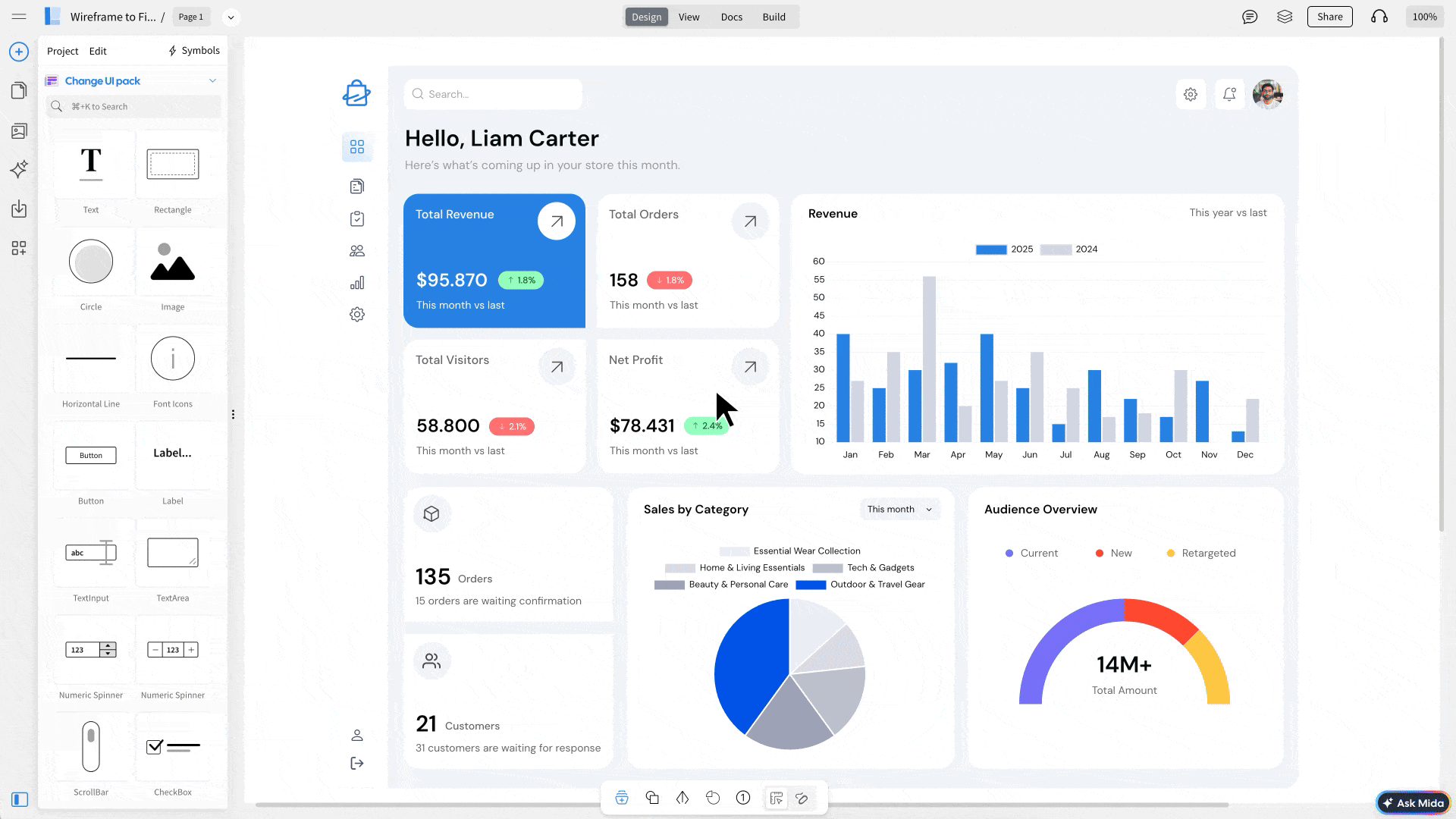
Dashboard Wireframe Examples
Dashboard wireframes must balance information density with clarity. The structural patterns here — sidebar navigation, KPI card rows, chart areas, data tables — are the building blocks of virtually every B2B SaaS product interface.
Ecommerce Wireframe Examples
Ecommerce wireframes must resolve conversion-critical layout decisions early: where does the primary CTA live, how is trust signalled near the buy button, and how does the checkout step indicator reduce abandonment. These examples demonstrate the industry's established patterns with annotations explaining the conversion logic behind each decision.
Login & Auth Wireframe Examples
Authentication screens have more conversion impact than most teams realize. The placement of social auth buttons, the visual weight of the "forgot password" link, and the copy on the primary CTA all meaningfully affect sign-in and sign-up rates. These wireframes follow current conversion-optimization best practices.
Showing 13 of 50+ examples. More added monthly.
Browse All Website Wireframes →Wireframe Annotation Standards: How to Document Your Decisions
Annotations are what separate a deliverable wireframe from a sketch. A wireframe without annotations forces every viewer to guess the intent behind each design decision — leading to feedback sessions that debate layout choices that have already been resolved. Annotations make your reasoning explicit and let stakeholders focus their feedback on the right level of the design.
What to Annotate
Not everything needs an annotation. The rule of thumb: annotate anything a developer, PM, or stakeholder might misinterpret, disagree with, or make assumptions about. Common annotation targets:
- Primary CTA placement and label
- Navigation patterns (sticky, collapsible, tab bar)
- Responsive breakpoint behavior
- Interaction states (hover, active, disabled)
- Content prioritization decisions
- Grid column counts and gutters
- Why an element is positioned where it is
- Which elements scroll vs stay sticky
- Image aspect ratio constraints
- Dynamic vs static content areas
- Error and empty state behavior
- Conditional UI visibility rules
Annotation Numbering Conventions
The industry standard is to use numbered callout circles (① ② ③) positioned near the element being annotated, with a numbered reference list below or beside the wireframe. The yellow badges you see in this library's examples follow this convention. When working in Figma, use the Annotations plugin or create a consistent component for callout numbers — this ensures annotation circles scale correctly across different viewport sizes.
Wireframing Best Practices: What Our Examples Follow
Every wireframe in this library follows the same professional standards. Here's what distinguishes a production-ready wireframe from an amateur sketch — and what you should apply to your own work.
Boxes with X = images. Horizontal lines = text. This visual language is universal and communicates content type without committing to specific copy or imagery. Inconsistent placeholder patterns create confusion about what is real content vs. placeholder.
Don't make stakeholders guess why something is positioned where it is. Annotations like "Primary CTA — above fold, 44px minimum touch target" or "3-column grid collapses to 1 on mobile at 768px" communicate intent and prevent design-by-committee feedback.
Mark which button is the primary action (visually dominant, filled) vs secondary (outline, less prominent). This prevents stakeholders from treating all buttons as equal and ensures conversion hierarchy is established before visual design begins.
For responsive designs, wireframe both viewport sizes in the same file. This exposes decisions that work on desktop but break on mobile — the most common source of late-stage "we didn't think about that" developer surprises.
Lo-fi for concept validation. Mid-fi for flow testing and stakeholder review. Hi-fi for visual direction sign-off. Using hi-fi wireframes to answer lo-fi questions wastes production time and creates premature design commitment that's difficult to reverse.
Most wireframes show only the happy path. But what does the empty state of this dashboard look like? What does a failed form submission look like? Wireframing these states prevents scope surprises during development and ensures a complete UX before engineering starts.
The Wireframe Review Checklist
Before presenting a wireframe to stakeholders or handing off to developers, run through this checklist:
- ☐ Primary CTA is visually dominant and labeled with final copy (not "Button")
- ☐ Navigation pattern is clearly defined (sticky, collapse point, mobile variation)
- ☐ Content hierarchy matches business priority (most important content above fold)
- ☐ Interactive elements are visually distinguishable from static content
- ☐ Mobile viewport version included (or breakpoint notes annotated)
- ☐ Error states wireframed for all form inputs
- ☐ Empty/zero-data states wireframed for all data-driven components
- ☐ All annotations are clear and reference specific design reasoning
- ☐ Fidelity level matches the current project stage
Recommended Wireframing Tools by Use Case
The wireframe examples in this library were created across three professional tools. The right tool depends on your fidelity target, team collaboration needs, and how complex the interactions you need to represent are.
| Tool | Best For | Fidelity Range | Free Plan |
|---|---|---|---|
| Figma | Collaborative wireframing, design systems, dev handoff | Mid-Fi to Hi-Fi | ✓ Yes (3 projects) |
| Balsamiq | Rapid lo-fi sketching, stakeholder conversations | Lo-Fi only | ✓ 30-day trial |
| Axure RP | Complex interactive prototypes, conditional logic, enterprise | Mid-Fi to Hi-Fi | ✗ Paid only |
| Whimsical | Fast lo-fi wireframes, flowcharts, mind maps | Lo-Fi to Mid-Fi | ✓ Yes (limited) |
| Miro | Collaborative team ideation, workshop facilitation | Lo-Fi | ✓ Yes (3 boards) |
For most professional wireframing work in 2026, Figma is the default choice — it handles lo-fi wireframes, mid-fi layouts, hi-fi mockups, and developer handoff in one tool. Balsamiq remains the fastest option specifically for early-stage lo-fi work where the sketchy aesthetic actively helps set stakeholder expectations. See our full Best Wireframing Tools 2026 comparison for detailed scoring across 10 criteria.
Frequently Asked Questions
A wireframe should include the layout structure, navigation elements, placeholder content areas, calls-to-action, and key UI components. It should clearly show hierarchy (what's most important), flow (how the user moves between screens), and functionality (what actions the user can take). A wireframe should NOT include final colors, brand typography, photography, or detailed visual styling — those belong in hi-fi mockups and design specs.
A good wireframe clearly communicates layout hierarchy, user flow, and intended functionality without distracting with visual design. The best wireframe examples in professional practice share five characteristics: consistent placeholder patterns (boxes for images, horizontal lines for text), clearly labeled interactive elements, annotations explaining key design reasoning, appropriate fidelity for the project stage, and visible consideration of mobile viewports. The wireframes in this library follow all five principles.
A wireframe is a low-to-mid fidelity schematic showing layout, structure, and functionality — no final colors, fonts, or imagery. A mockup is a high-fidelity static representation that includes brand colors, typography, real imagery, and visual polish. Wireframes come before mockups in the design process and are typically 4–10× faster to create and iterate on. A prototype adds interactivity and clickable flows on top of either a wireframe or mockup. See our full comparison: Wireframe vs Mockup vs Prototype.
The wireframe examples in this library were created in Figma (best for collaborative and mid-to-hi-fi wireframes), Balsamiq (best for lo-fi sketchy wireframes), and Axure RP (best for complex interactive wireframes). Each card shows the tool used. Figma is the most commonly used tool in professional UX teams in 2026. See our full tool comparison: Best Wireframing Tools 2026.
Lo-fi wireframes take 5–30 minutes per screen using tools like Balsamiq or paper. Mid-fi wireframes take 30 minutes to 2 hours per screen in Figma. Hi-fi wireframes take 2–8 hours per screen. The single biggest time variable is whether you're designing from scratch or adapting an established pattern — which is why studying examples like those in this library can cut your initial wireframing time by 30–60%.
The most important wireframes for a mobile app are: the onboarding flow (first-run experience), the home/feed screen, the primary feature screen, the profile/settings screen, and the navigation pattern (tab bar vs hamburger vs bottom sheet). Start by wireframing these five before expanding to secondary screens. The mobile wireframe examples in this library cover onboarding and feed patterns — click "Mobile App" in the filter bar above to see them all.
The wireframe examples on this page are published for reference, study, and inspiration. You're welcome to use the documented design patterns in your own work. The interactive examples are rendered as CSS/HTML code rather than downloadable Figma files. We're developing a free Figma wireframe template kit based on this library — sign up to our newsletter to be notified when it becomes available.
At lo-fi, use only placeholder lines (no real copy). At mid-fi, use real labels for navigation items and CTAs (exact button copy matters for conversion and usability), but continue using placeholder lines for body text. Using Lorem Ipsum for body text in wireframes is acceptable, but using generic button labels like "Button" or "Click Here" is a mistake — CTA copy is a design decision, not a content decision, and should be finalized at wireframing stage.
Social Media Wireframe Examples
Social media interface patterns are highly established — users have strong expectations about cover photo dimensions, avatar positioning, follow/unfollow button placement, and feed card structure. These wireframes codify those conventions and annotate the specific dimensions that affect visual balance.